
My knowledge of architecture began with the Covid days, when I’d squeezed my way into a co-working space where, aside from me, every single person was an architect. And that’s also where it ended. As much as I enjoyed the company and admired the aesthetics the people there had managed to create out of the non-descript open space in a former Swatch building, I’m fairly confident I didn’t learn a single proper thing about architecture during the two years.
Still, as I kept trying to pin down why I felt so strongly about the new Tudor Date-Day in its olive green variant, the word “architectural” kept springing in my mind.
Why it shouldn’t be for me
Before we get back to that, let’s first take a step back. You see, on paper, there are mostly reasons why that watch should not be for me. To start, I’ve generally had very little interest in Tudor’s contemporary dress line. Like many of us, today’s Tudor is what Rolex no longer is: the well-made low key toolwatch. I’m talking Black Bay 58, Pelagos 39 or even more recently the North Flag GMT. No fuss but somehow Hans Wilsdorf-approved and good enough for most of us.
Then of course there’s the vintage stuff. Subs, sure, but also pretty nifty stuff on the dressy side. I’m a sucker for old school Oyster Princes, and in fact previously owned a 1984 Date-Day with a blue dial along with gilt hands and indices. The charm works twice on me, once for the vintage vibes and a second time around for the humble tone of something made for the honest, less affluent, working person, as Tudor was.
Finally, I like my Tudors to be, well, Tudors. Not a lesser Rolex. Sure, the raison d’etre of Tudor is its connection to Rolex and ignoring that would be denying some of its DNA. But I like it when the connection is subtle. Starting with its name, the “Date-Day” connection to the original Rolex model is anything but that.
When things started to change, kind of
Last year, when Tudor released its 1926 Luna, I started getting a bit confused. The idea of a moonphase from Tudor felt to me like Sushi at McDonald’s. But I couldn’t get myself to dislike the watch itself. The design felt intentional and coherent. The proportions were good. It wasn’t the Tudor my brain was programmed for but it actually felt legit and, somehow, on-brand.
Then, just before Watches & Wonders, as I was strolling around Rue Centrale in Bienne, my eye got unexpectedly stuck on a Tudor 1926, in the window of Art du Temps. There was something both elegant and unassuming about the piece. So unassuming in fact that I’d probably seen it a dozen times without ever noticing. I walked in and tried it on. Despite its strikingly reasonable price, I didn’t pull the trigger as I couldn’t really see how the watch would fit in my rotation of overthought wrist companions. But I could easily imagine it being the perfect daily wear for a sane person.
After the Geneva event, everyone was talking about the Monarch. I liked it. In fact, I really liked it, being a sucker for 1930s-ish watches and anything related to Rolex Viceroys and Bubblebacks. But having that allure in a contemporary package just felt a bit odd to me. I get the benefits of resistance and reliability versus an actual vintage, alongside knowing the dial was not refinished, but the cosplay is just a bit much for me. Also, I always worry about how neo-vintage watches age. Like, if you’re born old, what happens when you actually get older?
When I least expected it…
The contemporary Tudor Date-Day had never caught my attention. Its 2026 variant was no exception upon its release. If I remember correctly, the PR focused on the blue dial version with roman numerals and possibly the other colors with baton indices. Olive green with roman numerals was nowhere to be found, at least as I recall.
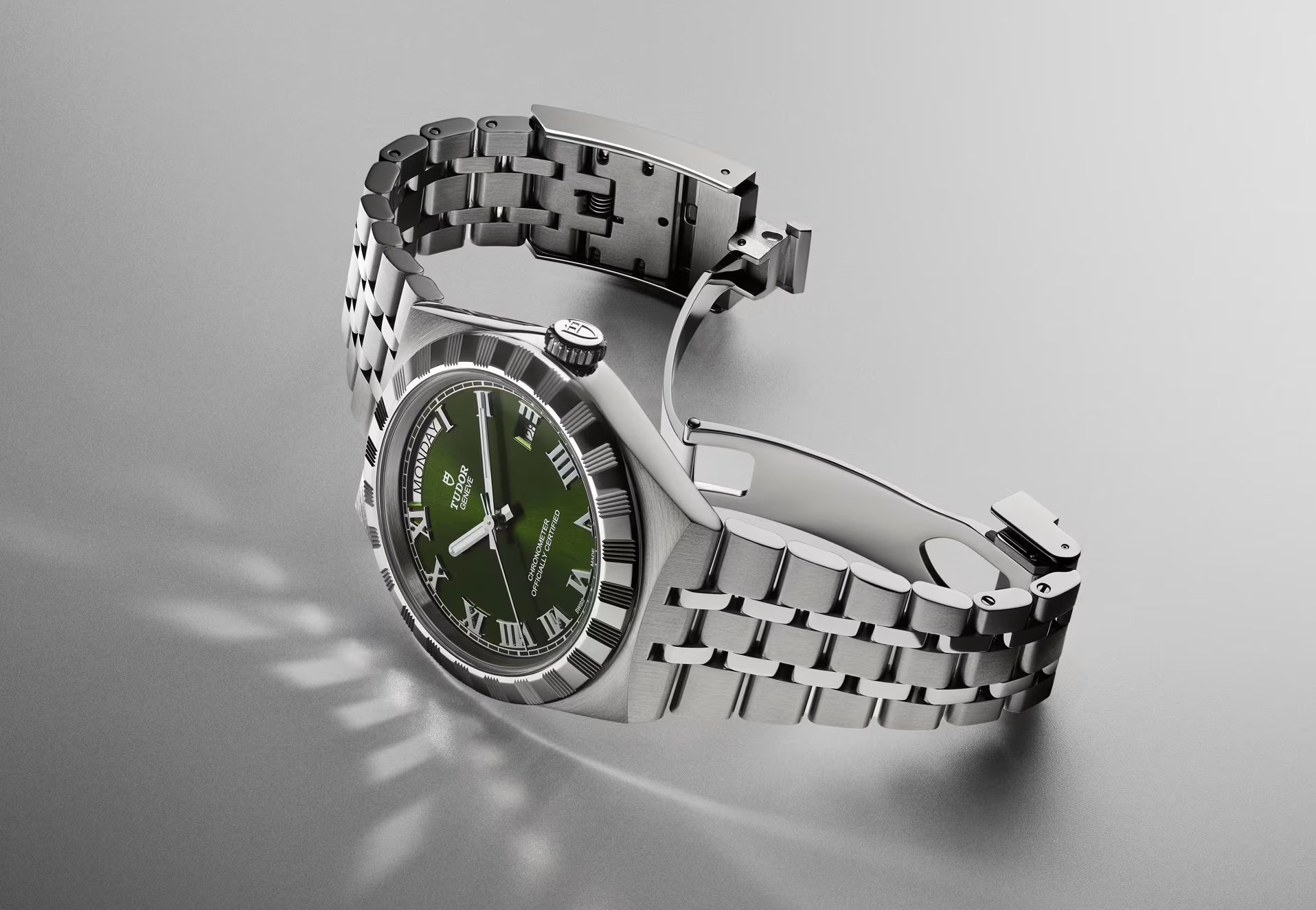
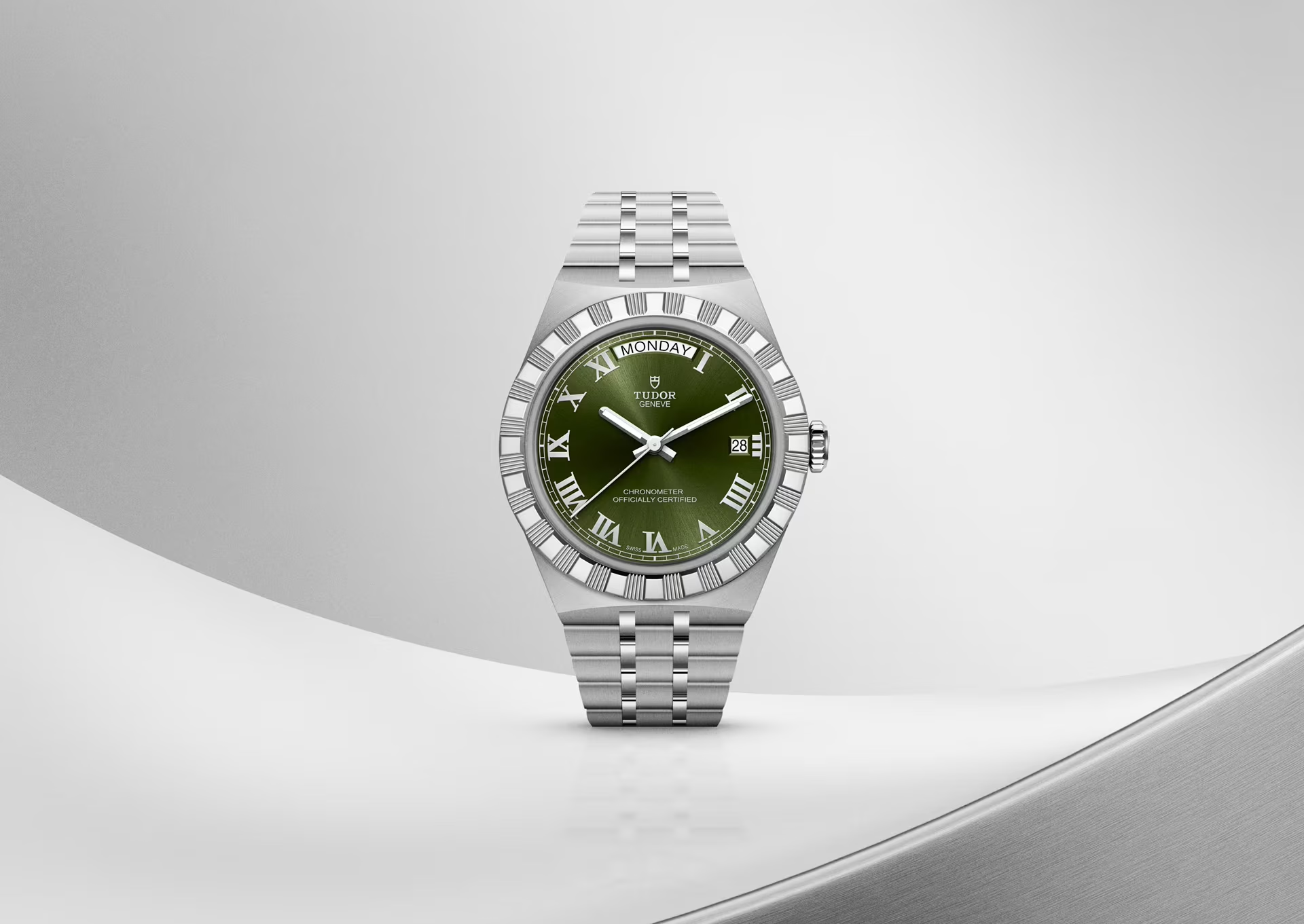
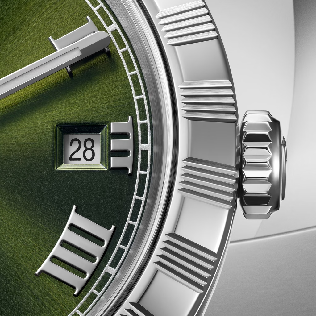
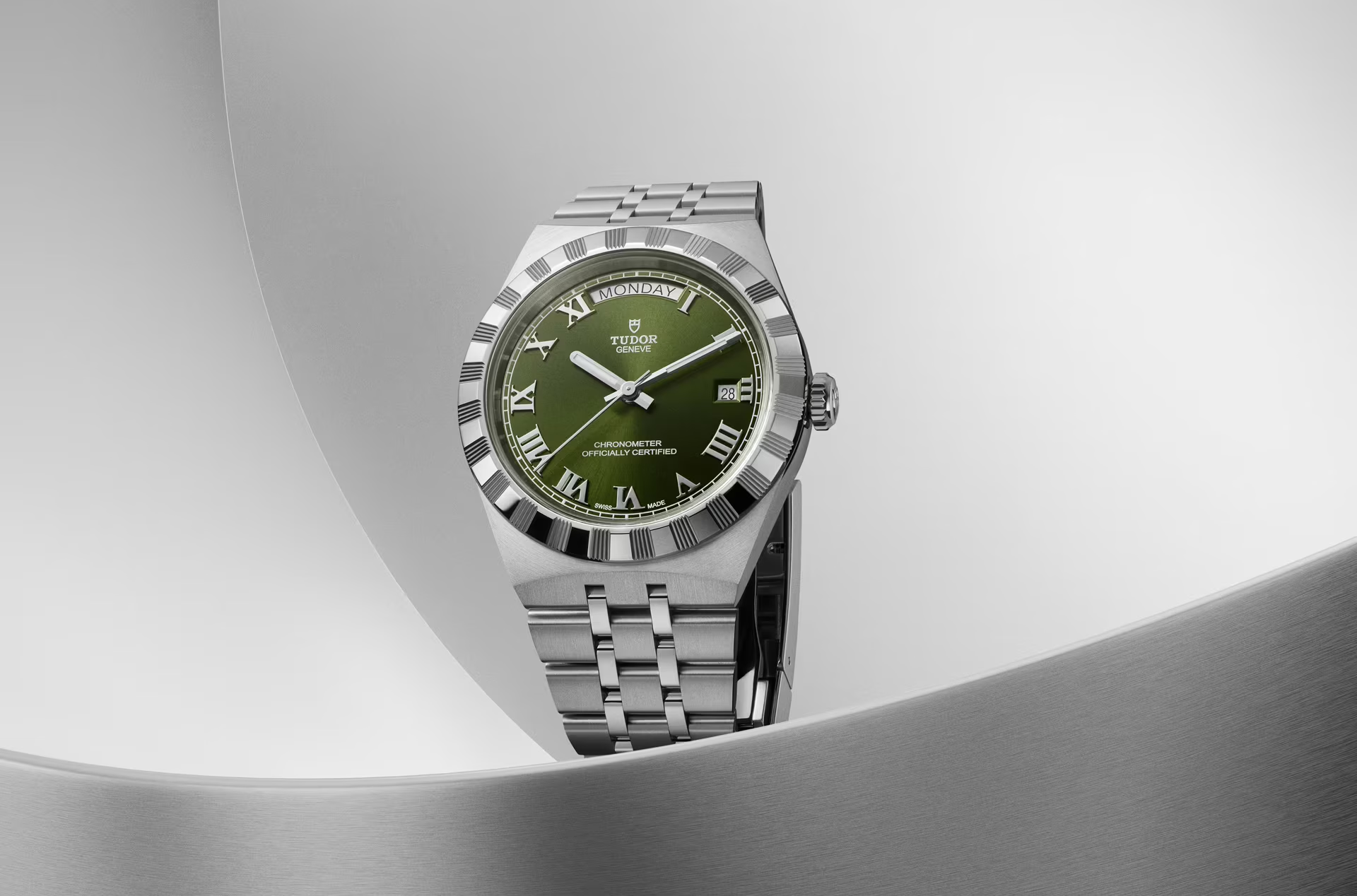
I can’t remember what brought me to Art du Temps that day, a few weeks later—although I’m usually pretty good at finding an excuse to waste their time. As I was about to step outside, I stopped and tilted my head to the left. The corner of my eye had been caught by what felt like a brutalist construction disguised as a watch. Sitting in the thigh-high display next to the main entrance, the 40 mm Date-Day standing there didn’t seem in the slightest fancy or glitzy. It looked solid, low-key and, in a way I could not explain to myself, “architectural.”
Intrigued, I tried to better understand what could possibly cause such an impression at the opposite end of the marketing positioning of the watch: the classic, “Royal” counterpart to Rolex’s dressy flagship coming across as “raw concrete on the wrist.”
Industrial, Structural Columns
So here I went off to do my research. I walked to the Bienne public library, not far from the old town, and climbed the stairs up to the Architecture section. OK fine, I just used AI. Still, I challenged Gemini a bit and won’t insult you by simply copying and pasting the findings. They were conclusive though, so here they are, in my own words.
Unlike for instance the Rolex Day-Date and its fluid, rounded counters, the contemporary Tudor Date-Day is all about sharp planar transitions. The finishing is more straight-forward. Not compromised, but not nearly as refined as on the Rolex. Even the polished surfaces shine low. There’s mirroring, sure, but “scintillation” (is that a word?) is nowhere to be found.
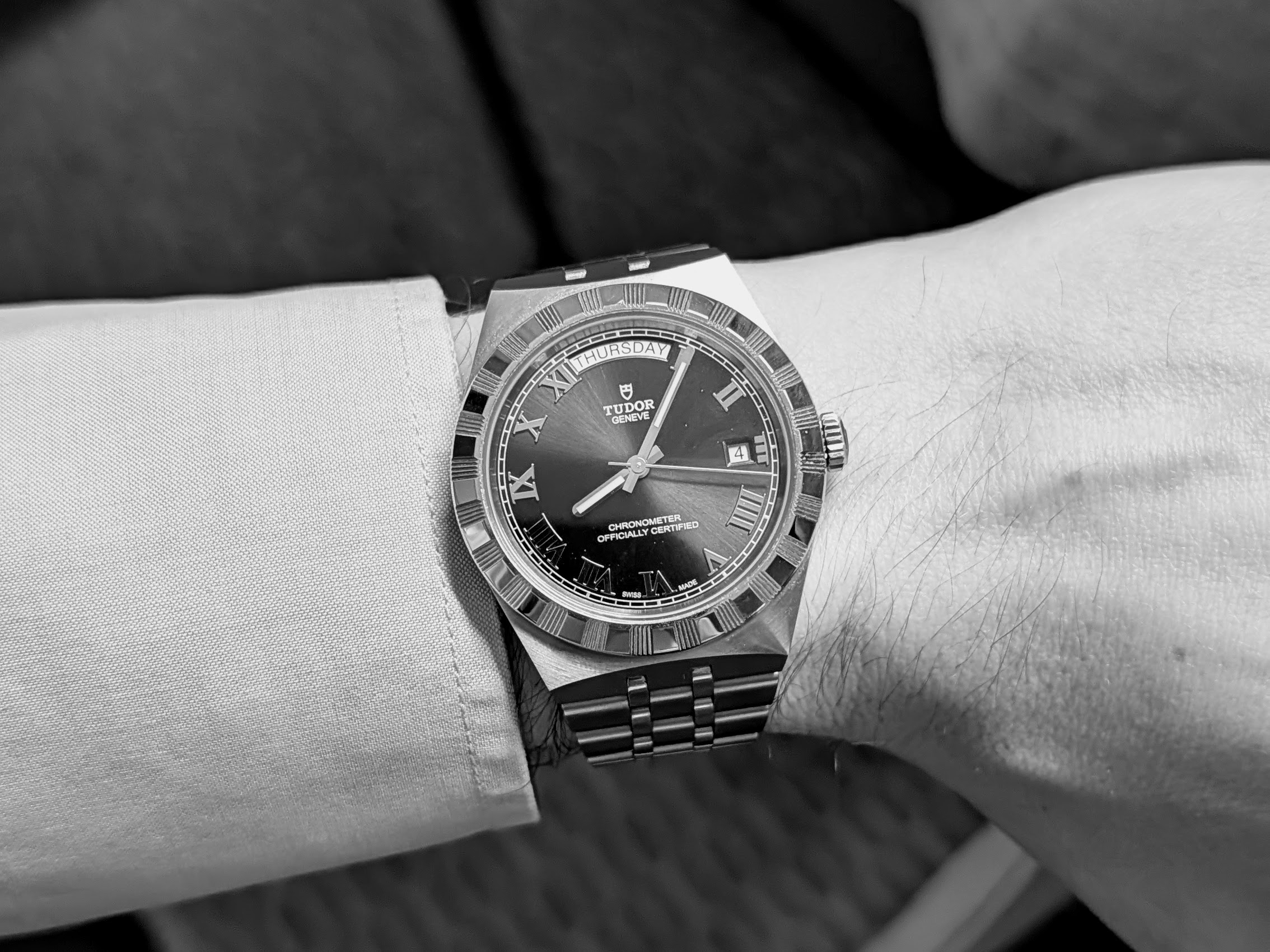
The wide faceted lugs drop straight into the bracelet. The stepped links feel like interlocking structural blocks. The bezel’s cut grooves create a toothed, gear-like or columnar effect. When the eye steers inward, it meets the wide, flat and sharply beveled Roman numerals and its vertical bars that directly mirror the notches cut into the bezel. That, in turn, flows into the vertical lanes of the bracelet
But wait. Wasn’t that all the case with the former model? The 41 mm Date-Day. Aside from the dial (more on that in a sec) and the “in-house” COSC movement with its 70 hour power reserve, the case and bracelet are pretty much the same, right? Well, I thought they were. And then, on a recent trip to Germany (so recent that I’m still on it while writing this), I saw one in an AD display.
I won’t give names because I’m pretty sure they shouldn’t still be exhibiting those, but I’ll thank [XXX] in the Bonn old town for the revelation. The piece seems much chunkier. And not in a sporty way. More like a person with large feet trying to squeeze into laced sandals three sizes below. How can just an extra millimeter create that effect?
Then it struck me. It’s about the bracelet shoulder width at the case interface. Spoiler: it’s large. I then looked up the actual specs. On the 41 mm, the bracelet starts at 25.7 mm width. It then tapers down to 16 mm at the clasp. On the new version, the bracelet starts at 23.5 mm, also ending at 16 mm. That more than 10% difference is a game changer in proportion, and partly explains why I never got the same “architectural” vibes on the previous gen.

Dialling in
Now, let’s zoom into what is perhaps an even more critical difference between the two generations: the dial. The main tweak, having two lines with “Chronometer – Officially Certified” may not seem like much. In practice though, it makes a massive difference to the overall balance. That big empty space is no longer, well, empty.
Then, there’s the color. The previous generation of the Royal Date-Day came in standard dressy sporty watch tones such as black, silver, champagne and blue. It also had some less usual suspects like salmon and chocolate brown. But it’s only with this year’s release that came the olive green. While not dissimilar to the one on the Rolex Day-Date, it’s generally a bit cooler, and less deep. Crucially, unlike other variants of the same watch, the dial here just kind of blends in the background. With its khaki tones, it almost evokes utilitarian and field-adjacent aesthetics.
Wrapping it all up, almost dissimulated by the camouflage air of the dial, the roman numerals are like a final touch of structure, holding it all together half behind the scenes. It’s my little brutalist on the wrist.
Final thoughts
Call me crazy. It wouldn’t be the first time. But some of you will hopefully see where I’m coming from. For everyone else who made it this far down, maybe check out the Date-Day in olive green the next time you walk by a Tudor AD. Because the piece is not a hype sweetheart, you may even need to ask them to take it out from the safe. I’ll be curious to hear what you think.